Designing a poster may seem like a task best suited for a graphic designer, but it doesn’t have to be that difficult! One way to ease the process is to use a program you are already familiar with, such as Microsoft PowerPoint.
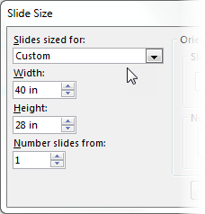 PowerPoint slides can be scaled up to 56 inches in both width and height. In PowerPoint 2013-2016, under the Design tab, click on the Slide Size button and choose Custom Slide Size to set your height and width. If you want a to create a larger poster, such as 3.5 feet tall by 5 feet wide, scale down your dimensions to 28 by 40 inches, and when you have your poster printed, ask for it to be enlarged by 150%.
A well designed poster has good balance between graphics, text, and blank space. Blank space includes margins and the areas between your content. With ample blank space, your poster will look uncluttered, and your audience can better distinguish the order and separation of your poster content.
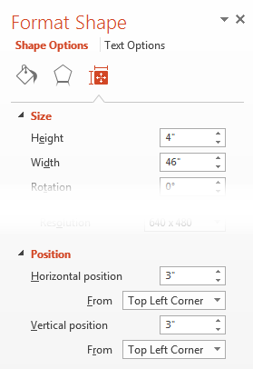 Your margins are set by the size and placement of your content areas, which can be found in the Format Shape pane. Right-click on any shape to pull up the Format Shape pane, and select the Size and Properties tab. Use the precise sizing and position options to accurately place your content in a layout. Objects can also be aligned or distributed equally through the Drawing Tools tab.
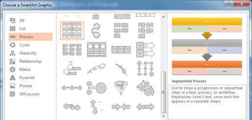
Graphics help to draw interest to your poster, and charts and figures can show complex information that can be understood quickly. If you don’t have a lot of information for charts and figures, you can still add graphical elements to your poster. From the Insert tab, select SmartArt. Choose from a gallery of diagrams, including List, Process, Cycle, Hierarchy, Relationship, Matrix, and Pyramid. Adding text to these diagrams allows you to convey your research content with added design.

HSLS offers a hands-on workshop, PowerPoint for Conference Posters, which expands your PowerPoint skills for designing posters. For assistance on poster design, contact Julia Dahm, Technology Services Librarian.
~ Julia Dahm


 Please join us as we celebrate the season with the annual PalPITTations Concert on Wednesday, December 14, at 12:30 p.m., on the upper floor of Falk Library. The PalPITTations are the a capella vocal group of health sciences students from the University of Pittsburgh. Light refreshments will be served. All are welcome for this free concert.
 As you head out for the holidays, grab a Leisure Reading book from HSLS’s collection of newly-published fiction and nonfiction. The Leisure Reading Collection is located at the rear of the main floor of Falk Library in the comfortable seating area.

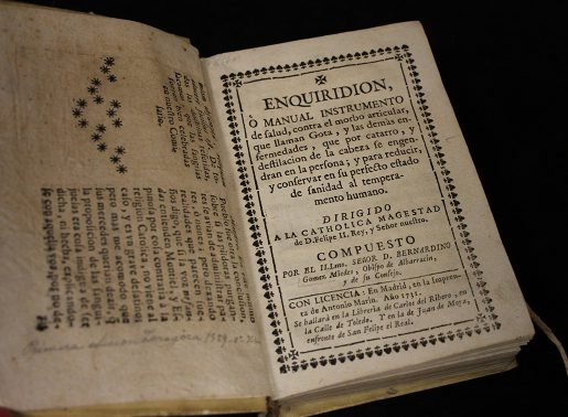
 Bernardino Gómez Miedes (1520-1589) was a Spanish humanist well-versed in many disciplines. He authored two important books: Commentarii de sale (1572), the earliest discussion of salt, and Enchiridion (1589), a manual about gout. An edition of the latter, published again in Madrid in 1731, caught the eye of Dr. Gerald Rodnan. Dr. Rodnan was an avid book collector, professor of medicine, and the former division chief of rheumatology and clinical immunology at the University of Pittsburgh, who donated his impressive collection of rheumatology books to the Falk Library.

 On September 22, the Health Sciences Library System and Department of Biomedical Informatics hosted the symposium “Bringing Rigor and Reproducibility to Research.” Over 100 people attended to hear the featured speaker, Victoria Stodden, speak about facilitating reproducibility of computational results. She was followed by a panel discussion from
  PowerPoint slides can be scaled up to 56 inches in both width and height. In PowerPoint 2013-2016, under the Design tab, click on the Slide Size button and choose Custom Slide Size to set your height and width. If you want a to create a larger poster, such as 3.5 feet tall by 5 feet wide, scale down your dimensions to 28 by 40 inches, and when you have your poster printed, ask for it to be enlarged by 150%.
 Your margins are set by the size and placement of your content areas, which can be found in the Format Shape pane. Right-click on any shape to pull up the Format Shape pane, and select the Size and Properties tab. Use the precise sizing and position options to accurately place your content in a layout. Objects can also be aligned or distributed equally through the Drawing Tools tab.