Following the 2020 introduction of Pitt’s EIT Accessibility Policy, HSLS has endeavored to increase the accessibility of its digital instructional materials. This commitment to a more inclusive learning environment has been supported through HSLS’s creation of accessible Zoom classes, Panopto videos, and digital class files. Though these goals might seem intimidatingly broad and difficult to implement in your own work, they all depend on the same core tenets of universal design. By familiarizing yourself with these guiding principles of accessibility, you will be equipped to create equitable materials across different mediums and platforms.
One of these common accessibility standards is the proper use of significantly contrasting colors. “Color contrast” refers to the difference in perceived brightness between adjoining colors, such as the contrast between text and its background. Content created with highly contrasting colors (like black and white) is much more legible than content created with minimally contrasting colors (such as light gray and white). Using adequate color contrast will make content more readable for all, including those with visual impairments or color blindness.
Color contrast is indicated via a ratio that measures the relative brightness of two colors. This ratio can range from 1:1 (for colors that have no contrast) to 21:1 (for colors that have maximum contrast). To quickly determine the contrast ratio of two colors, you can utilize an online tool like WebAIM’s Contrast Checker. Per Pitt’s EIT policy, adjoining colors should have a contrast ratio of at least 4.5:1.
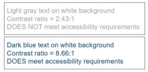
It’s also important to note that some programs like PowerPoint include their own color schemes as defaults, but these don’t always meet the standards for minimum contrast. For instance, gray text on a white background may have a contrast of 2.4:1, which does not meet Pitt’s EIT policy. Changing the text to another color, such as a dark blue, would achieve the acceptable contrast of greater than or equal to 4.5:1 (see image).
As you evaluate color contrast in your content, look out for the following:
- In all written content, text color should contrast sufficiently against its background color.
- In graphics, adjoining colors should contrast sufficiently against each other.
- Vital information should not be communicated solely by color. For instance, color-coded content such as graphs should also utilize another visual element (such as shapes or textures) to differentiate data points.
To learn more about the EIT policy and how you can implement accessibility improvements in your own work, visit the Office for Equity, Diversity, and Inclusion’s page on digital accessibility. The University Center for Teaching and Learning also provides informative resources on educational equity and accessibility. Please contact the HSLS Technology Help Desk with questions regarding accommodations for HSLS classes and Falk Library’s efforts to provide accessible digital materials.
~Julia Reese