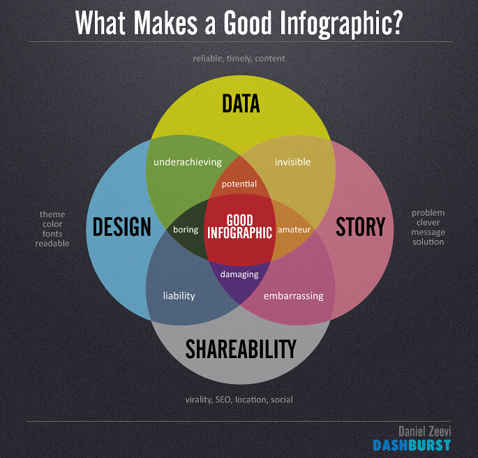
Are you looking for a new way to disseminate research data so that your findings are more clearly communicated? Perhaps you are tired of generating the same unengaging year-end reports. You may want to consider designing an infographic, which is a “visualization of data or ideas that tries to convey complex information to an audience in a manner that can be quickly consumed and easily understood.”1 Infographic is often used as a catchall term for information displayed visually. The best infographics communicate data or information in a visual format that is easy to digest.
Visualization can make a huge difference in how we perceive data. Infographics are more engaging, more accessible, more persuasive, and easier to recall. Another popular feature is their shareability. Infographics can be posted on social media, e-mailed, or easily included in posters or presentations.
CC BY-ND 2.0
There are different tools that you can use to create your infographic. Traditional design software such as PowerPoint, Microsoft Publisher, and Adobe Illustrator are often used by professionals. These will offer the most control and flexibility. Drag and drop creators are Web-based applications that allow you to work within a layout and choose from ready-made objects. Examples of these are Piktochart, Infogr.am, Easel.ly, Venngage, Canva, and Gliffy. The library offers classes in Photoshop and Illustrator. A portion of the HSLS Infographics: Data Visualization for the Facebook Age class focuses on Piktochart.
The next time you are thinking about marketing, conveying information to patients, or even augmenting your data section in a publication, consider whether replacing raw data or information with an infographic would benefit your audience.
~Rose Turner
1. Smiciklas, M. The Power of Infographics: Using Pictures to Communicate and Connect with Your Audiences. Indianapolis, IN: Que Publishing, 2012.