 You’ve collected your data—now what? Having a basic set of data visualization skills will enable you to effectively communicate their significance. From understanding how your audience will interpret a bubble chart on your conference presentation to having proficiency with data visualization software packages, there is a wide variation in levels of mastery.
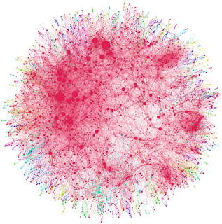
Begin by learning some of the basic principles of visual design. You may already subconsciously practice some of these. Many of us use symmetry when creating visual objects because it can create a sense of balance or cohesiveness. Other rules challenge conventional wisdom. Did you know that pie charts are controversial in the design world? In his seminal work, The Visual Display of Quantitative Information, Edward Tufte argues that pie charts should never be used because it is very difficult for the viewer to compare quantities. Over thirty years later, we still see many data designers continuing to use pie charts. On what side of the debate do you fall?
Once you have the basic rules down, you can start scoping out some of the many data visualization tools that are available. Microsoft Excel can be used to create basic visualizations. Tableau is free software that can be used to analyze, synthesize, and then create interactive visualizations to present your data. If you’re motivated, R is a programming language and environment that can be used to create data visualizations. Try a few tools before committing so that you choose which is best for your data set and skills.
Whether you become an expert on beautiful and minimalist bar charts or learn how to create interactive three dimensional visualizations, data visualizations will help your audience explore your data for new insights and meaning.
HSLS offers two classes related to data visualization. If you’re interested in continuing the discussion, please attend our Data Visualization class on October 10 or Infographics class on October 7.
~Rose Turner